


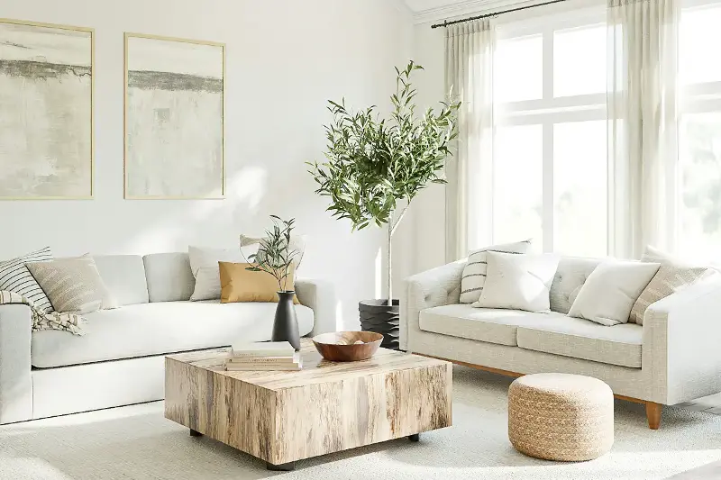
Choosing the right paint color can turn any home into a peaceful sanctuary, but did you know strategic shades also work wonders on your perception of space and light? Expert color choices have the power to make even compact rooms feel noticeably larger, brighter, and more inviting. Whether you are refreshing a cozy apartment or updating a family home, mastering the art and science of color selection can completely transform your living spaces.
The Science Behind Color and Spatial Illusion
While it is well known that lighter colors make rooms feel larger, there is actual science behind this classic design principle:
- Light Reflection: Pale, cool hues reflect both natural and artificial light, helping it bounce across surfaces to make walls visually recede.
- Expanding Palettes: Crisp whites, soft grays, sky blues, and delicate blush pinks instantly convert tight quarters into airy retreats.
- The Power of Undertones: Warm undertones (like creamy yellows and beige) foster a cozy atmosphere, while cool undertones (such as mint green or ice blue) maximize openness and tranquility.
Living Room: A Light and Welcoming Retreat
As the heart of the home, the living room benefits from versatile, luminous shades that enhance natural light:
- Sophisticated Canvas: Soft dove gray, classic ivory, and gentle blue-gray provide an expansive backdrop for layering textured decor.
- Reflective Finishes: Using paint with an eggshell or satin finish subtly bounces light across the room for added dimension.
- Architectural Tricks: Painting the ceiling and trim a shade lighter than the walls creates a visual lift, making ceilings feel higher.
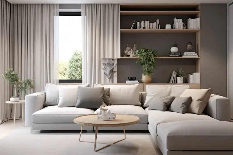
Kitchen: Crisp Cleanliness with Subtle Energy
Kitchens thrive on colors that evoke freshness while maintaining a bright, open aesthetic:
- Timeless Neutrals: Crisp white remains an enduring favorite, especially in sunlit spaces.
- Warm Pastels: Pale greens and soft buttery yellows add welcoming warmth without overwhelming small footprints.
- Glossy Details: Utilizing glossy finishes on backsplashes and cabinetry reflects surrounding light, while a pale aqua island provides a refreshing focal point that enhances spatial flow.
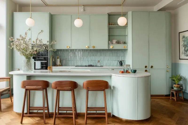
Bedroom: Restful Shades for an Expansive Sanctuary
Your bedroom should feel like a serene oasis, where color choices encourage relaxation without feeling restrictive:
- Soothing Tones: Muted blues, soft blushes, and sage greens make walls recede visually while creating a peaceful atmosphere.
- Warm Neutrals: Off-white, soft taupe, and creamy greige offer warm alternatives to stark whites without sacrificing brightness.
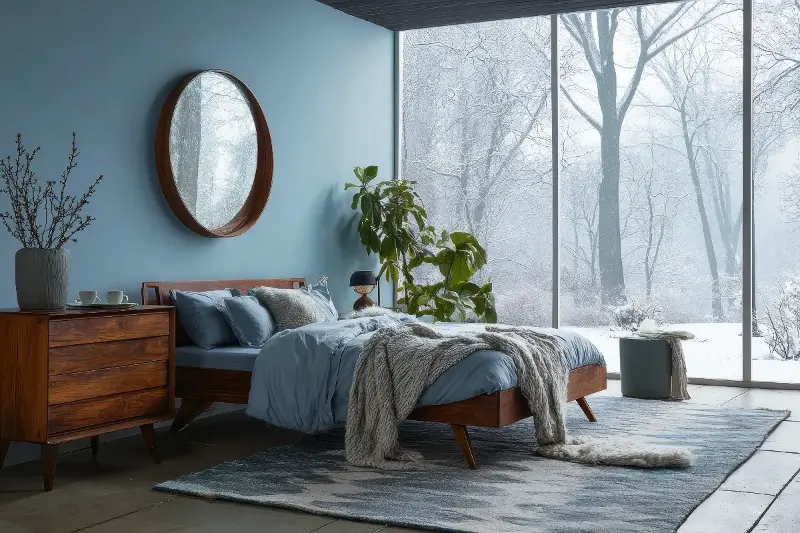
Bathroom: Maximizing Light in Compact Spaces
Bathrooms are often the smallest areas in a home, making strategic color choices essential:
- Airy Hues: Powder blue, seafoam green, and soft blush pink amplify available light while creating a spa-like feel.
- Reflective Harmony: Pairing light paint with glossy wall tiles and mirrors multiplies brightness.
- Unified Ceilings: Painting the ceiling the exact shade as the walls eliminates harsh dividing lines, making the room feel taller.
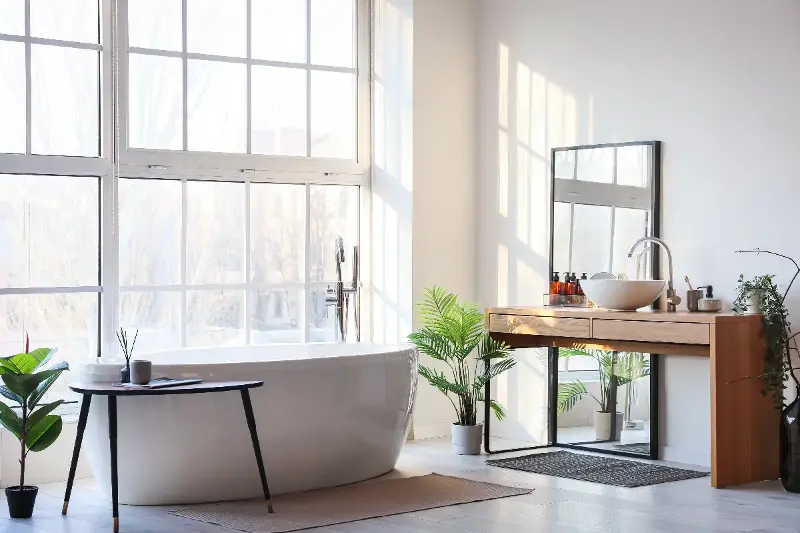
Hallways and Transitional Spaces: Unifying the Home
Connected areas and hallways dictate the flow of your entire home. Maintaining color consistency across adjoining rooms creates an uninterrupted visual line that unifies your floor plan. Soft gray, pale beige, and off-white work exceptionally well in transitional spaces, ensuring every corner of your home feels open, cheerful, and full of natural light.